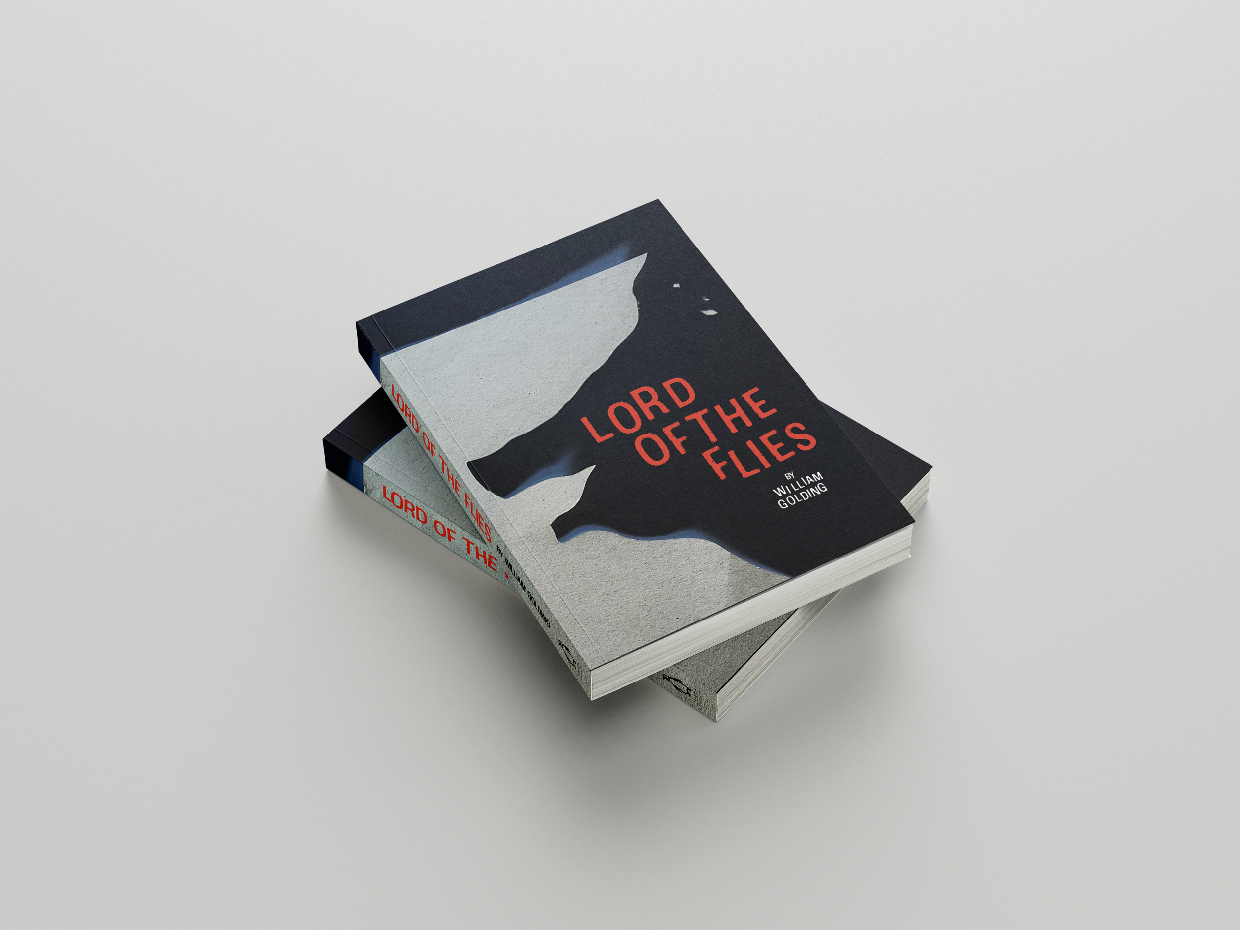
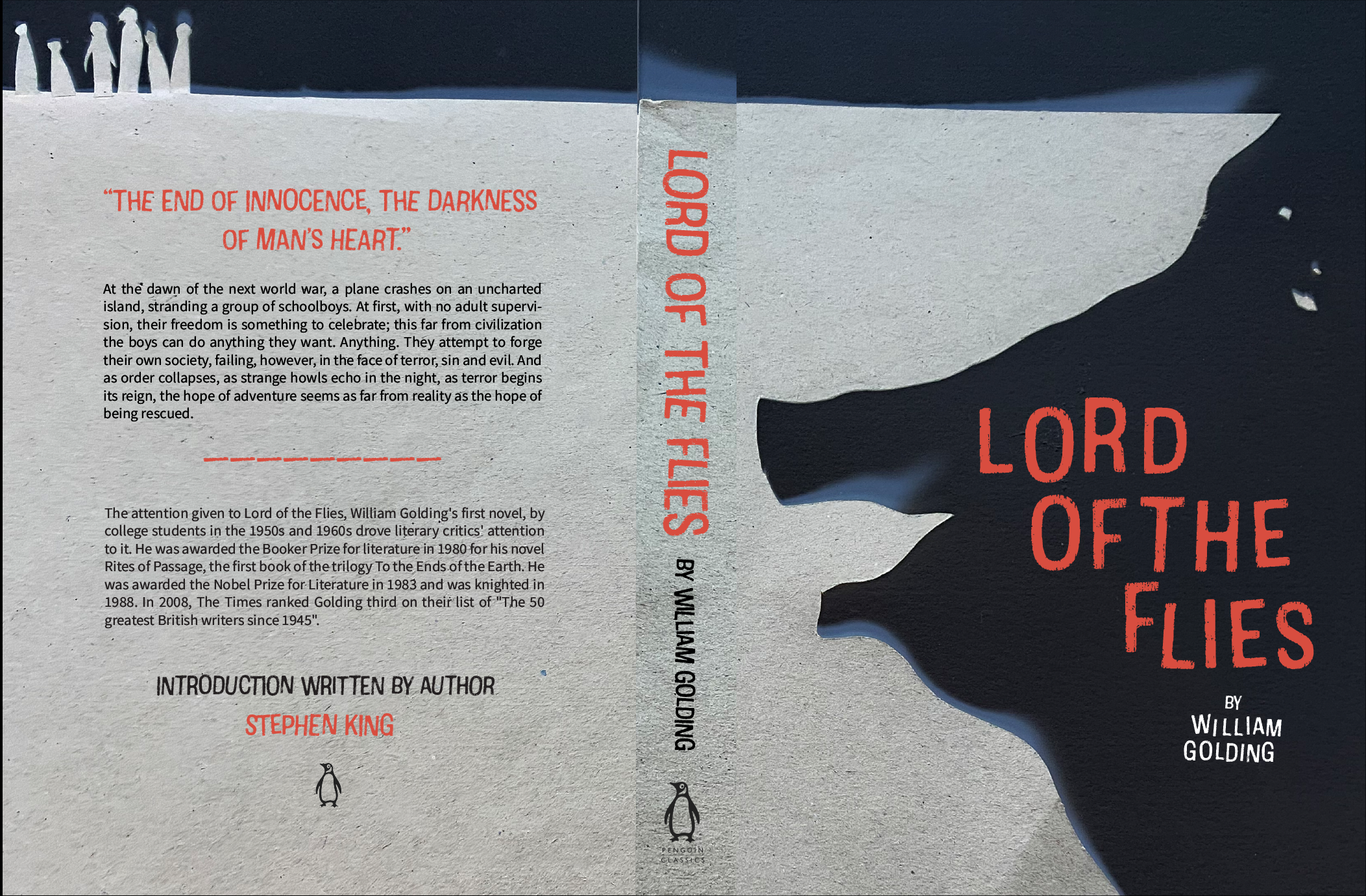
LORD OF THE FLIES: BOOK COVER REDESIGN
I have always loved the dark and spooky themes and imagery in Lord of the Flies by William Golding, taking inspiration from these haunting feelings, I redesigned the cover of this classic novel. To create this piece, I combined tiny cut outs from construction paper, photography, photoshop color inversions, and illustrator creating an unsettling effect on the book cover.

ITERATIONS
After receiving critique on my original book cover (far left) I decided to use the negative space as a means to tell more of the story. PLOT SPOILERS AHEAD: A big portion of The Lord Of The Flies centers around this aloof and malevolent pig head, the school boys isolated on a remote island begin to believe there is a beast living on the island out to get them. This portion of the book with the pigs head had always frightened me yet intrigued me as it was such an unsettling motif. After having critique, I realized I could bring in that unsettling imagery in to the negative space on the front cover. For this process, I cut out of paper a new cliff in order to make the negative space look like a pigs head, photographed it and inverted the shadows in photoshop to give the image the wispy white smoke effect (for right).